The Quiet Weeks: How Woodland Materials Stabilize Seasonal Palettes
The quiet weeks between seasons demand transitional color solutions that flowers alone can’t always provide. Designers in the Pacific Northwest know this well—those in‑between windows when demand continues, but blooms jump ahead or lag behind the calendar. Valentine’s Day to Mother’s Day. Late summer to early fall. Early winter to spring. These weeks create palette instability that can disrupt even the most intentional design work.
At Woody Shoots, we see these quiet zones differently. They’re not gaps. They’re opportunities to anchor a palette with woodland materials that behave predictably, photograph beautifully, and hold their tone regardless of weather or bloom timing.
Learn more about our PNW woodland atelier on the About Woody Shoots page.
Why Transitional Color Matters in the PNW
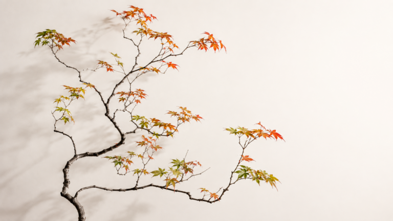
Seasonal shifts in the Pacific Northwest are subtle. Light softens. Greens mute. Bronze and olive begin to surface weeks before autumn officially arrives. Designers feel this shift long before clients do, and they need materials that support the transition without forcing it.
Flowers often resist this moment. They arrive too bright, too early, or too saturated for the mood. Woodland materials do the opposite—they settle the palette. They bridge the shift.
The Predictable Tones That Keep Palettes Steady
Woody Shoots specializes in tones that stabilize designs during transitional weeks:
These tones don’t compete with flowers. They guide them. They create continuity when the season is undecided.
Texture as a Seasonal Anchor
Transitional color isn’t solved by flowers—it’s solved by texture.
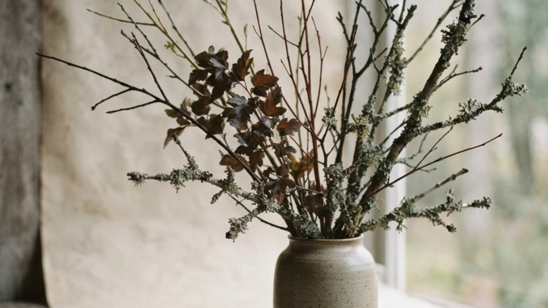
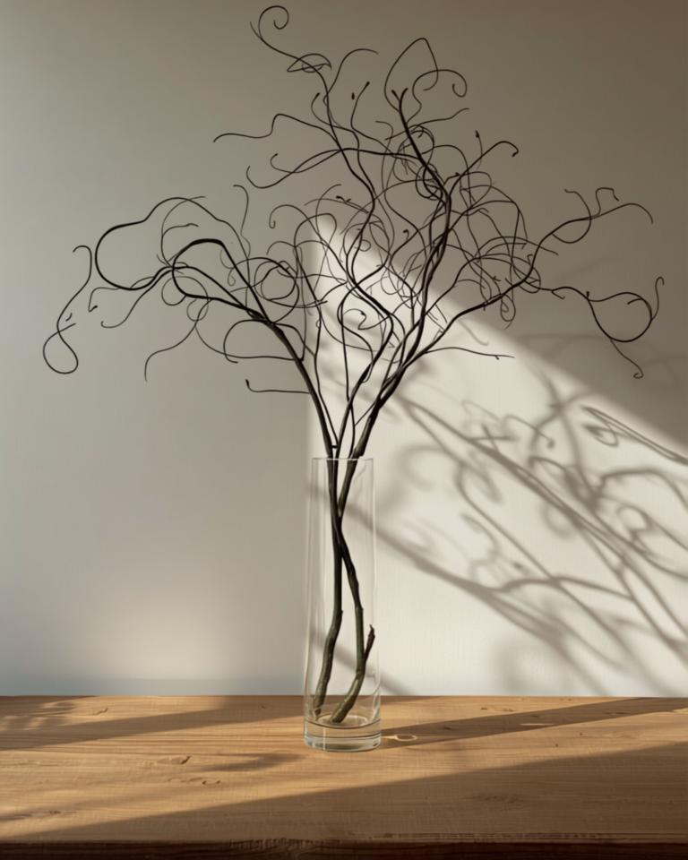
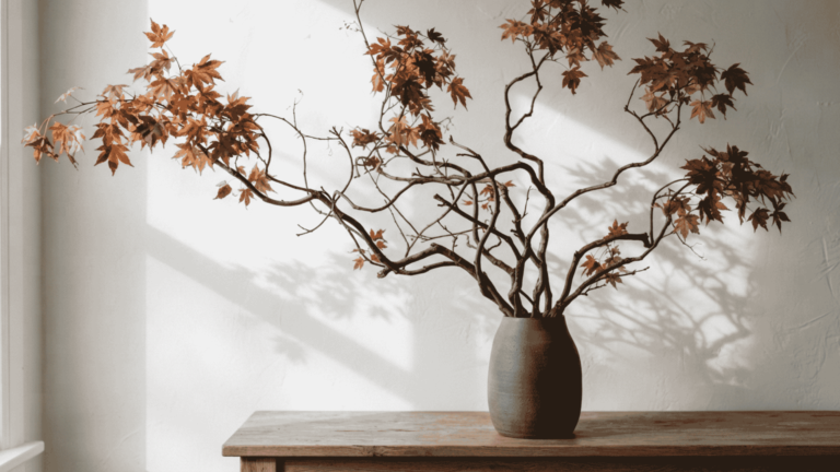
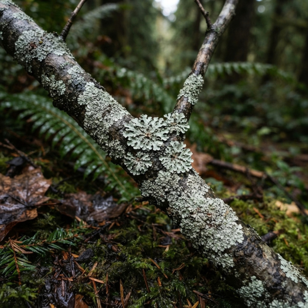
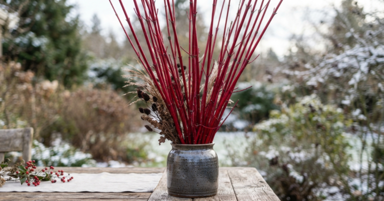
Woodland materials carry tone through structure. Dogwood deepens predictably. Ninebark bronzes. Alder cools into charcoal. Willow softens into pale green. Lichen adds quiet, atmospheric grey. These shifts happen slowly and reliably, giving designers control during weeks when blooms feel out of sync.
Texture becomes the stabilizer. Color becomes the accent.
Quiet Weeks, Steady Work
Designers across the PNW continue producing installations, events, and weekly accounts during the quiet weeks. Clients don’t pause. Demand doesn’t pause. Your palette shouldn’t pause either.
By integrating woodland materials, designers maintain cohesion across:
- Valentine’s → Mother’s Day
- late summer → early autumn
- autumn → early winter
- winter → early spring
These are the commercial windows where transitional color solutions matter most.
For custom transitional palettes, reach out through our Contact page.
A Woodland Approach to Seasonal Continuity
Woody Shoots exists for designers who value intentional palettes and seasonal accuracy. Our woodland materials offer a way to move through the quiet weeks with confidence—anchoring your designs in tones that reflect the Pacific Northwest landscape as it shifts.
Transitional color isn’t a trend. It’s a tool. And in the PNW, it’s essential.
Read our recent Echinops ritro field note for more PNW performance observations.

One Comment
Comments are closed.