Contrast as Structure in PNW Native Botanical Stems for Floral Designers
Contrast in PNW native botanical stems for floral designers shapes how materials read in a composition — through light, shadow, tonal weight, and the natural architecture of woodland stems. Western sword fern (Polystichum munitum) grounds a composition without anchoring it — structural and lush simultaneously, creating tonal depth that allows contrast to read clearly. Designers working with PNW woodland materials understand that contrast is not a color decision. It is a structural one. The woodland makes this visible long before bloom arrives.
The five-acre woodland in the Arlington–Stanwood corridor carries contrast in its own architecture — dark evergreen pockets, pale branch lines, and the open negative space that appears between species as the season shifts. This is the contrast designers work with when they work with native woody cuts. It is not added. It is observed.
How Contrast Behaves in PNW Woodland Materials
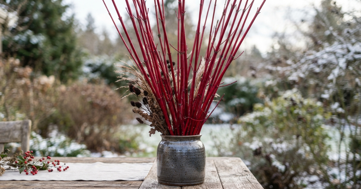
Contrast begins with light behavior. Materials like red osier dogwood (Cornus sericea) hold a strong vertical silhouette that reads sharply against winter negative space. The deep burgundy stems carry tonal weight even before they enter the vessel. When paired with the matte white berries of snowberry (Symphoricarpos albus), the contrast is structural — a dialogue between weight and lift.
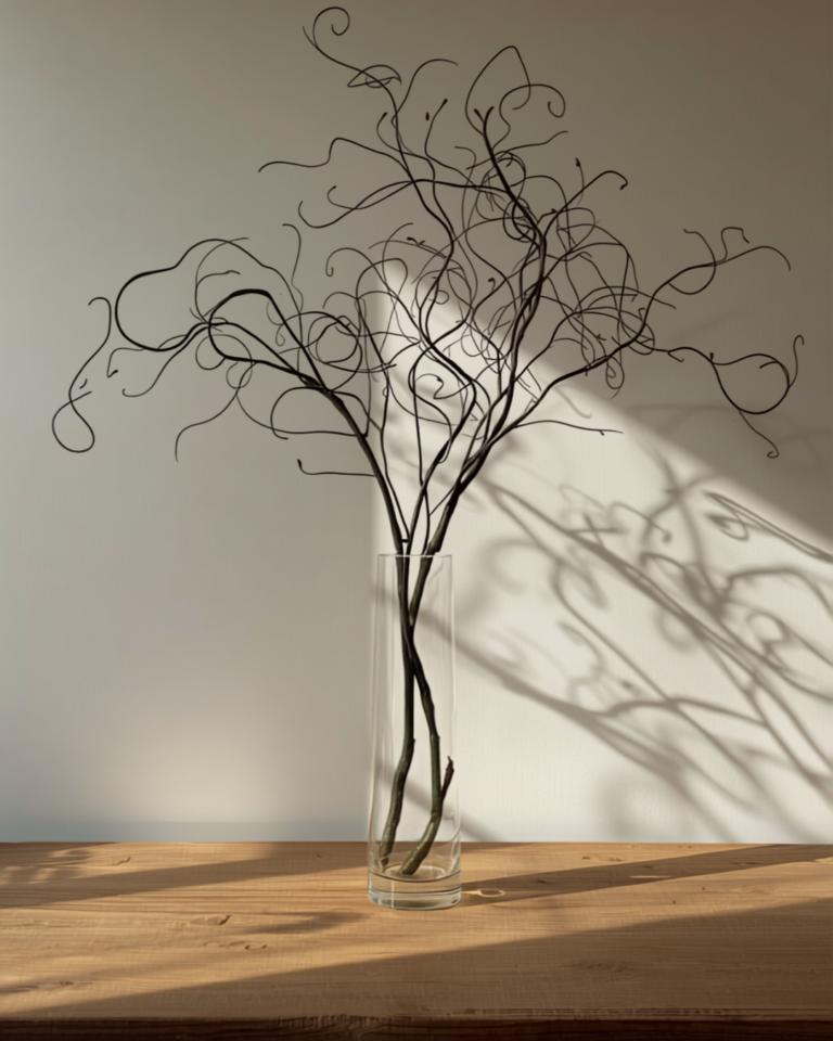
Cascara (Frangula purshiana) introduces a different mode of contrast. Its gestural, hand-drawn line creates movement that reads against the stillness of evergreen foliage. The contrast is not color. It is posture. Designers who work with cascara understand that its irregularity is the point. It creates tension that cultivated foliage rarely offers.
Contrast also appears in the woodland’s seasonal progression. Osoberry (Oemleria cerasiformis) arrives at the threshold of early spring — slender, lightly branching, carrying delicate clusters while the landscape still feels withheld. Its presence is pale, almost translucent. When placed beside the darker evergreen register of western red cedar (Thuja plicata), the contrast becomes a seasonal signal.
Tonal Weight and the Role of Evergreen Grounding
Evergreen materials carry tonal weight that defines the lower register of a composition. Western sword fern grounds without dominating. Western red cedar drapes with quiet density. These materials create the shadow pockets that allow lighter stems to read.
Designers often think of contrast as brightness. In woodland work, contrast is often darkness — the stable tonal base that allows lighter stems to articulate line, gesture, and rhythm. Without grounding, contrast collapses. With grounding, contrast becomes architectural.
This is why cultivated foliage often flattens a composition. Its tonal weight is generalized. Native foliage for floral composition carries specificity — moisture, season, exposure — and that specificity creates contrast naturally.
Contrast Through Negative Space and Branching Rhythm
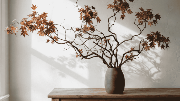
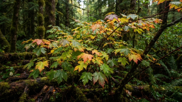
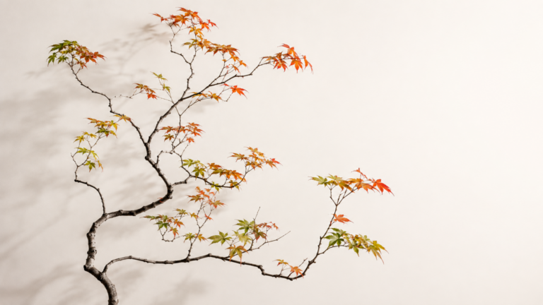
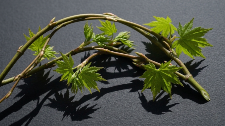
Negative space is one of the strongest contrast instruments in woodland work. Snowberry’s berry placement creates rhythm that spaces the eye through branching rather than filling it. Vine maple (Acer circinatum) shifts its silhouette across the year — open and layered in spring, deeply colored in autumn, skeletal in winter. Each stage carries a different contrast relationship with the materials around it.
Contrast is not always a pairing of opposites. Sometimes it is the spacing between them. Designers who work with gestural branching materials from the Pacific Northwest understand that negative space is not absence. It is structure.
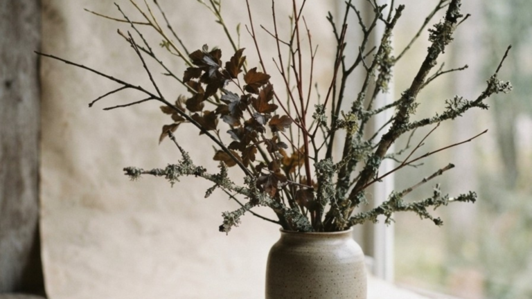
Oakmoss lichen (Evernia prunastri) alters the visual temperature of a composition even in small amounts. This is contrast at its quietest — a pale, atmospheric detail gathered only after wind and rainstorms release it naturally. The woodland sets the window. The designer reads the contrast.
Seasonal Contrast: How the Woodland Sets the Palette
The woodland’s contrast shifts by season. Winter offers strong vertical line and deep tonal weight. Early spring offers pale movement and threshold materials. Mid-spring introduces arching rhythm through red-flowering currant (Ribes sanguineum). Autumn brings berry presence and saturated foliage.
Contrast shifts with the woodland — seasonal, ecological, and governed by the harvest windows and progression that determine what designers can actually work with.
The contrast available in February is not the contrast available in May.
This is why contrast cannot be manufactured. It must be observed. The woodland sets the tempo. Designers follow it.
Applying Contrast Intentionally in Composition
Contrast is most effective when it is structural:
- Line vs. drape — dogwood establishing posture beside cedar’s softening movement
- Tonal weight vs. lift — sword fern grounding snowberry’s hovering berries
- Gesture vs. stillness — cascara’s irregular line beside the quiet density of evergreen
- Shadow vs. light — cedar’s deep register allowing osoberry’s pale clusters to read
These are not aesthetic choices. They are compositional decisions. Designers who work with native woody cuts for floral installation understand that contrast is the mechanism that reveals form.
Contrast is not added at the end. It is built from the first stem.
If your project dates are taking shape and you are considering how contrast might guide your seasonal palette, reach out about what the woodland is offering.